Tired of scrolling through endless beige and gray living rooms that all look the same? You’re not alone. After years of safe, neutral interiors dominating design magazines and social media, homeowners are finally embracing what they’ve secretly wanted all along color that feels alive, personal, and joyful. Whether you’re working with a commitment-phobic rental or ready to paint every wall in your house, these 35 colorful living room ideas will give you the confidence to break free from boring and create a space that actually reflects who you are.
The best part? You don’t need to be a professional designer or have an unlimited budget to make color work. Some of these ideas require just a single bold pillow, while others invite you to go all-in with saturated walls and patterned ceilings. We’ve organized these concepts from subtle pops to full-on maximalist glory, so you can find your perfect comfort level. Ready to finally make your living room feel like you? Let’s dive in.
1. Cherry Red Statement Walls
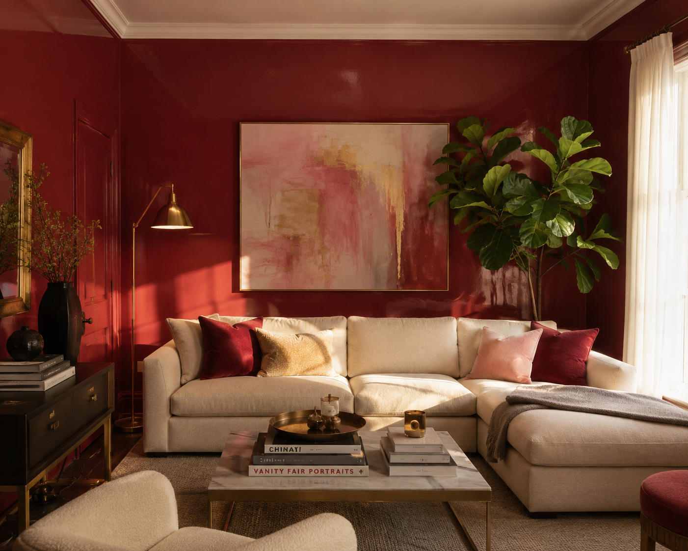
Cherry red is having a major moment in 2026, and for good reason this saturated, jewel-toned red creates an instant mood of warmth, energy, and sophistication that neutrals simply can’t match. When you paint all four walls in a rich cherry red, you’re not just adding color; you’re creating an immersive experience that makes the room feel intimate, dramatic, and undeniably confident. This works especially well in living rooms with good natural light, where the red will glow during the day and turn cozy and candlelit-friendly in the evenings.
The key to making cherry red work without feeling overwhelming is balancing it with the right furniture and accents. Pair it with cream or off-white upholstery to keep things from feeling too heavy, and introduce warm wood tones through coffee tables, shelving, or flooring to add organic warmth. Metallic accents in brass or gold will catch the light beautifully against the red backdrop, while green plants provide a natural contrast that keeps the space feeling fresh and alive. This is a bold choice, but it’s the kind of bold that makes people walk in and say, “Wow, this is my room.”
2. Pastel Blue Serenity with Coral Accents
Soft pastel blue walls create a surprisingly versatile foundation that feels both calming and sophisticated, especially when you layer in unexpected pops of coral or peach for contrast. This color combination works because blue and coral are complementary on the color wheel he cool blue provides a serene backdrop while the warm coral adds energy and visual interest without being aggressive. It’s perfect for living rooms that need to feel relaxing but not boring, energetic but not chaotic.
To execute this look successfully, choose a pastel blue with enough gray in it to feel grown-up rather than nursery-like think Benjamin Moore’s Quiet Moments or Sherwin-Williams’ Sea Salt rather than a primary baby blue. Then introduce coral through a single statement piece like a velvet armchair, a large piece of artwork, or even just a collection of throw pillows and a chunky knit throw. The beauty of this approach is flexibility, if you ever tire of the coral, it’s easy to swap out without repainting the entire room.
3. Beige Sofa with Pink, Green, and Gold Accents
If you already have a beige or tan sofa and think you’re stuck in neutral land, think again this classic piece is actually the perfect canvas for experimenting with bold, jewel-toned accents. The trick is to treat your beige sofa like a neutral suit and dress it up with accessories that would make a fashion designer proud: hot pink velvet pillows, emerald green throw blankets, mustard yellow vases, and gleaming gold accents throughout the room. This approach lets you have fun with color without committing to painted walls or expensive furniture.
The secret to making this multi-color approach feel intentional rather than chaotic is repetition and symmetry. Don’t just throw one pink pillow on the left and call it a day, buy pillows in pairs and arrange them symmetrically, repeating your accent colors at least two or three times throughout the space. For example, if you have pink pillows on the sofa, echo that pink in a vase on the coffee table, a candle on the mantel, and maybe even a small piece of artwork. The gold accents act as a unifying bridge, tying all the different colors together and adding a touch of glamour that elevates the whole look.
4. Moody Dark Living Room with Charcoal and Jewel Tones
Moody, dark living rooms are one of the biggest trends of 2026, and they’re particularly popular in regions with long winters where homeowners want to embrace the cozy rather than fight it. Painting your walls in deep charcoal, navy, or forest green creates an intimate, cocooning atmosphere that feels luxurious and dramatic, especially when paired with rich jewel-toned furniture and warm metallic lighting. This look proves that color doesn’t always mean bright, it can mean deep, saturated, and intensely atmospheric.
The critical factor in making a dark room work is lighting, you absolutely cannot rely on a single overhead fixture. Layer in multiple light sources: floor lamps with warm bulbs, table lamps on side tables, maybe even LED strips behind shelving or along the ceiling line to create a soft ambient glow. Brass or copper accents will reflect that light beautifully, preventing the space from feeling like a cave. This approach works especially well in larger rooms that can handle the drama, but even smaller spaces can pull it off if you balance the dark walls with lighter furniture and plenty of reflective surfaces.
5. Bohemian Maximalism with Layered Colors and Textures
Bohemian maximalism is all about embracing the “more is more” philosophy layering jewel tones, global textiles, vintage finds, and personal collections into a space that feels collected over time rather than purchased from a single catalog. This style gives you permission to break traditional design rules: mix patterns that “shouldn’t” go together, pile on colorful pillows in clashing prints, hang a vibrant tapestry on the wall, and display that hand-painted vintage cabinet you found at a flea market. The result should feel joyful, personal, and unapologetically eclectic.
The key to making maximalism work without tipping into chaos is ensuring there’s some underlying cohesion, usually through a recurring color palette or material. For example, you might mix a dozen different patterns, but they all contain shades of blue and orange. Or you might have furniture from five different eras, but they all feature warm wood tones. This look also works best when it evolves organically, start with one or two statement pieces you truly love, then build around them slowly as you find new treasures. Trying to create a maximalist room all at once often results in a space that feels staged rather than lived-in.
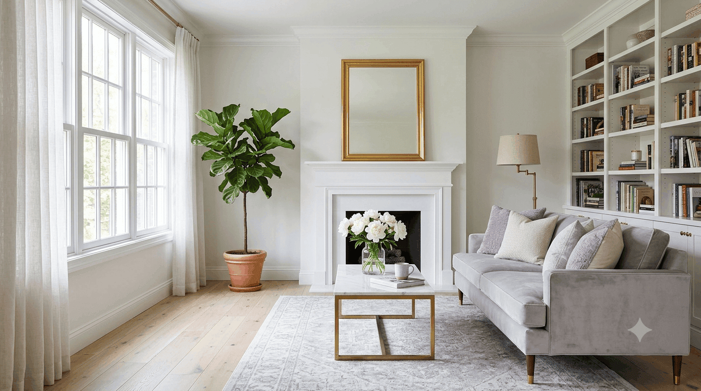
6. Grey Couch with Strategic Color Pops
A gray couch is one of the most common furniture investments in American homes, and it’s actually a brilliant foundation for colorful living room design contrary to what the “gray is boring” crowd would have you believe. The neutral tone allows you to switch up your color scheme seasonally or as your taste evolves without replacing major furniture pieces. Layer in colorful throw pillows, vibrant artwork, a patterned rug, and maybe a jewel-toned throw blanket to inject personality. This approach gives you flexibility and keeps your space feeling current without constant renovation.
The trick is choosing the right shade of gray and the right types of color accents. Avoid anything too cool or blue-toned unless you’re specifically going for an industrial vibe warmer grays with slight brown or taupe undertones work better in most lighting conditions and feel more inviting year-round. Then, when selecting your color pops, think about contrast: a warm gray sofa pairs beautifully with cool blues and greens, while a cool gray sofa shines with warm corals, mustards, and rusts. In warmer climates like Texas, homeowners especially appreciate how a gray couch doesn’t show dust and pet hair as readily as darker or lighter options, making it practical for everyday living while still allowing for serious style.
7. Bold Accent Wall in Deep Emerald Green
An accent wall in a bold, saturated color instantly transforms a living room from safe to statement-making without requiring a full repaint. Deep emerald green is particularly effective because it feels both luxurious and grounding, creating a focal point that anchors the entire room. This strategy is especially popular in open-concept homes where you want to define the living area without adding physical barriers. Pair it with neutral furniture and let the wall do all the talking, or go bolder by echoing the green in a few carefully chosen accessories.
Budget-conscious decorators appreciate this approach because it delivers maximum impact with minimal investment a single gallon of quality paint can completely shift the energy of your space. Just make sure to sample the color in different lighting conditions first; what looks rich and sophisticated at noon might feel overly dark by evening if your room doesn’t get enough natural light. Emerald green pairs beautifully with warm wood tones, brass or gold metals, and creamy whites, making it versatile enough to work with a wide range of existing furniture and decor styles.
8. Primary Color Play with Red, Blue, and Yellow
Embracing primary colors red, blue, and yellow might sound retro or childish, but when done right, it feels fresh, playful, and surprisingly modern. The key is balancing these saturated hues with plenty of white or neutral space to let each color breathe. Think a cherry red armchair, a cobalt blue throw blanket, and mustard yellow pillows against white walls and natural wood. This playful approach works beautifully in homes with young families or creative professionals who want their space to feel alive and unconventional.
A common mistake is using all three primary colors in equal amounts, which can feel chaotic rather than intentional. Instead, choose one as your dominant color (maybe 60% of your accents), a second as supporting (30%), and the third as a small pop (10%). This creates visual hierarchy and prevents the room from looking like a preschool classroom. Real homeowners who nail this look often stick to one bold furniture piece and layer in the other colors through smaller, easily changeable items like pillows, throws, and artwork. It’s a fun way to inject energy without committing to a full rainbow explosion.
9. Warm Neutral Paint with Earth Tone Layers
Warm neutral paint colors like honey beige, soft taupe, and creamy off-white create a welcoming foundation that pairs beautifully with earth tones throughout the room. Think terracotta, rust, olive green, and warm browns brought in through furniture, textiles, and natural materials. This palette feels inherently organic and grounding, perfect for anyone craving a connection to nature in their urban or suburban space. It’s a sophisticated alternative to stark white that still maintains brightness and airiness.
An expert-style tip: warm neutrals work beautifully in open-concept spaces because they flow seamlessly from room to room without creating harsh visual breaks. If your living room opens into a kitchen or dining area, choosing a warm neutral base allows you to introduce different accent colors in each zone while maintaining overall cohesion. This is particularly valuable in newer American construction where open floor plans dominate. The earth tone accents whether a rust-colored velvet chair, an olive green throw, or a terracotta vase add personality and warmth without overwhelming the space, making it feel both polished and lived-in.
10. Black Couch as a Sophisticated Color Anchor
A black couch makes a powerful statement and serves as a sophisticated anchor for surprisingly colorful design. Because black has such a strong visual weight, you can actually go bolder with your color choices elsewhere without the room feeling chaotic. Think jewel-tone pillows in emerald, sapphire, or amethyst, a vibrant patterned rug, or walls painted in rich, saturated hues. The black grounds everything and prevents the space from tipping into overwhelming territory. It’s a surprisingly versatile choice that reads modern and intentional.
The common mistake with black furniture is surrounding it with too many other dark elements, which can make a space feel heavy or cave-like. Instead, balance it with plenty of lighter elements white or cream walls, light wood accents, and ample lighting. This creates contrast and drama without sacrificing livability. Urban loft dwellers particularly love this look because it feels edgy and sophisticated without requiring a complete renovation of industrial spaces. The black couch also has the practical benefit of hiding wear and stains better than lighter colors, making it a smart choice for households with kids or pets who still want to embrace bold color elsewhere.
11. Teal Built-In Shelving with Warm Orange Accents
This room’s inviting feel comes from a classic complementary color scheme, executed perfectly with teal built-in shelving as the star. The formula is approximately 60% dominant cool color (the teal built-ins), 30% neutral foundation (the beige rug, chairs, and cabinet fronts), and 10% high-impact accent color (the warm orange pillows and decor). Teal and orange sit opposite each other on the color wheel, so they create a natural, high-energy pairing. The neutrals provide a crucial buffer zone, preventing the two bold colors from visually vibrating against each other.
A floor-to-ceiling built-in unit is a fantastic feature, but it can be a double-edged sword. It provides immense storage and a strong focal point, but it also locks you into a specific layout and color. Repainting a unit this large is a significant project, so make sure you’re committed to teal before you dive in. If you’re not ready for that level of commitment, you could achieve a similar feel by painting a single wall teal and placing freestanding bookcases against it. The orange accents should be kept relatively small, think pillows, a vase, or a piece of artwork to maintain that perfect complementary balance without overwhelming the space.
12. Sage Green and Rattan with Global Textiles
This cozy corner works because it expertly layers natural textures against a calming sage green backdrop. The smooth, painted sage walls provide a serene canvas for the woven texture of the rattan armchair and the bamboo blinds. The softness of the patterned pillows and the rich grain of the leather ottoman add even more tactile variety. This rich mix of materials makes the space feel collected and personal. The brass floor lamp adds a touch of metallic warmth, keeping the look from feeling too rustic.
Sage green is having a major moment in 2026 because it feels both fresh and timeless, bringing the calming energy of nature indoors without being too literal. It pairs beautifully with natural materials like rattan, jute, linen, and wood, making it perfect for anyone seeking a grounded, organic aesthetic. This look feels particularly relevant now as more people seek spaces that offer respite from digital overwhelm and urban stress. The earthy, nature-inspired palette also ages gracefully, small updates to textiles or accessories can refresh the look without requiring a full redesign.
For renters or those who can’t paint, achieve this vibe with sage green bedding, curtains, or a large area rug as your foundation. Layer in the natural textures through furniture and decor, rattan pendant lights, bamboo shades, jute rugs, and plenty of plants. The beauty of this palette is its flexibility; you can keep it light and airy with lots of white and cream, or go moodier with deeper greens and dark wood accents. Either way, you’ll create a space that feels like a breath of fresh air.
13. Navy Blue Library-Style Living Room
A navy blue living room evokes the sophisticated atmosphere of a traditional library, creating an intimate, cocooning space that feels both intellectual and luxurious. This deep, saturated blue works beautifully in rooms with good ceiling height, where it can create drama without feeling oppressive. Pair it with rich leather furniture, warm wood bookshelves, and brass or gold accents to complete the scholarly gentleman’s club aesthetic. This look is particularly effective in formal living rooms or studies where you want to encourage conversation and contemplation.
The key to making navy work without feeling like you’re in a basement is lighting, layer in multiple warm light sources rather than relying on a single cool overhead fixture. Table lamps with fabric shades, floor lamps positioned strategically, and even LED strips behind bookshelves will create a warm glow that makes the navy feel rich rather than dark. White or cream trim and ceiling will also help keep the space feeling airy despite the dark walls. This is a bold choice that pays off in spades for anyone who wants their living room to feel like a retreat from the outside world.
14. Mustard Yellow Accent Chair in Neutral Room
A single mustard yellow accent chair can transform an entire neutral living room, proving that you don’t need to go all-in on color to make a statement. This golden-yellow hue brings warmth and energy to spaces dominated by grays, whites, or beiges, creating an instant focal point that draws the eye. The beauty of this approach is its reversibility. if you ever tire of the mustard, swapping out a chair is far easier and cheaper than repainting walls or replacing a sofa. It’s the perfect entry point for color-curious decorators who want to test the waters.
Mustard yellow pairs particularly well with mid-century modern furniture, warm wood tones, and brass or gold accents, making it versatile across multiple design styles. It also works beautifully with cool grays and blues, creating a sophisticated contrast that feels intentional rather than random. For maximum impact, position the chair where it will catch natural light, which will make the yellow glow throughout the day. Add a complementary throw blanket or pillow in a coordinating color like teal or rust to create a mini color story that feels cohesive.
15. Terracotta Walls with Desert-Inspired Palette
Terracotta walls bring the warm, earthy tones of the Southwest into your living room, creating an instant vacation vibe that feels both grounded and exotic. This burnt orange-red hue works beautifully in spaces with plenty of natural light, where it glows warmly throughout the day. Pair it with cream or off-white furniture, natural wood accents, and touches of teal or turquoise for that classic desert color palette. This look is particularly effective in homes with adobe or stucco architecture, but it works equally well in modern spaces seeking warmth and character.
The trick with terracotta is choosing the right shade, too red and it feels aggressive, too orange and it reads juvenile. Look for terracotta paints with brown or pink undertones for a more sophisticated, grown-up feel. This color also pairs beautifully with handmade ceramics, woven textiles, and natural materials like jute and rattan, making it perfect for anyone drawn to artisanal, globally-inspired decor. Layer in plenty of plants to enhance the organic, earth-connected vibe, and don’t be afraid to mix in other warm tones like rust, ochre, and deep reds for a rich, layered look.
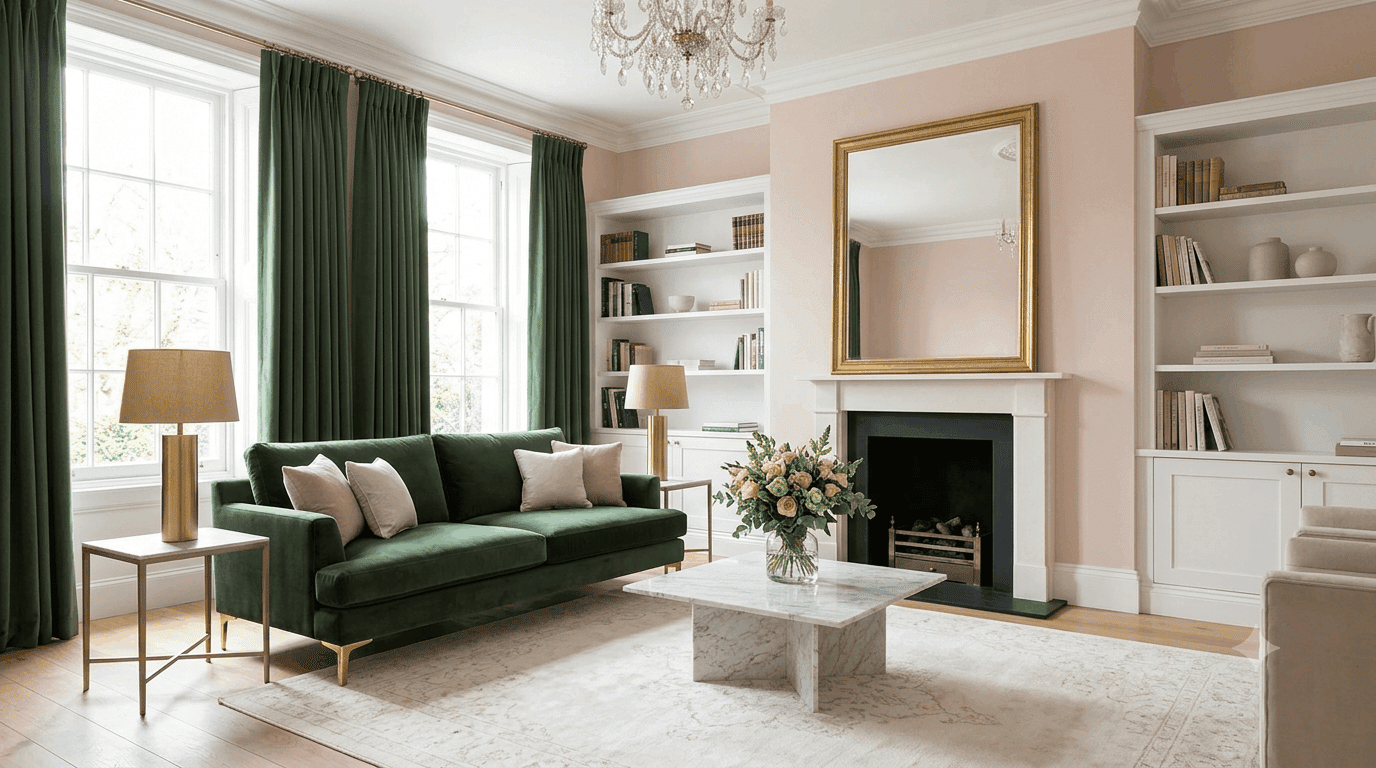
16. Blush Pink and Forest Green Glamour
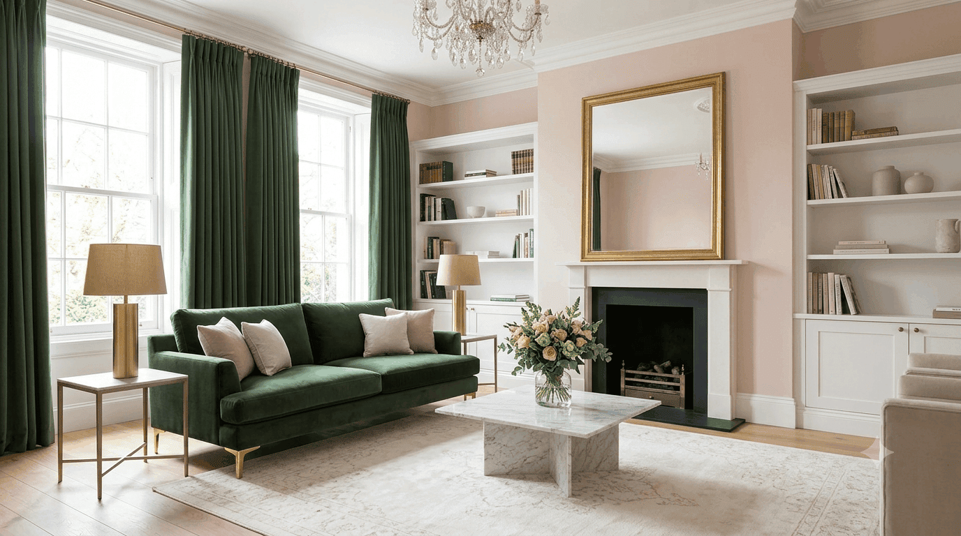
Blush pink and forest green create an unexpectedly sophisticated pairing that feels both romantic and grounded, perfect for anyone seeking glamour without the sterility of all-white design. The soft pink provides a dreamy, feminine backdrop while the deep green adds richness and prevents the space from feeling too sweet. This combination works beautifully in traditional or transitional spaces, where it can feel both fresh and timeless. It’s particularly effective in rooms with high ceilings or architectural details like crown molding and wainscoting.
To execute this look successfully, choose a blush pink with enough gray or peach in it to feel mature rather than bubblegum, think Benjamin Moore’s First Light or Sherwin-Williams’ Shell White rather than a bright barbie pink. Then layer in forest green through a velvet sofa, heavy drapes, or large-scale artwork. Gold or brass accents will add glamour and catch the light beautifully, while marble or stone surfaces keep things feeling elevated. This palette also works wonderfully in bedrooms or dining rooms if you want to carry the look throughout your home.
17. Colorful Gallery Wall as Focal Point
A vibrant gallery wall can serve as the primary source of color in an otherwise neutral living room, creating a dynamic focal point without requiring painted walls or colorful furniture. Mix and match artwork in various sizes, frames, and styles, but tie it together with a cohesive color palette, perhaps blues and greens, or warm oranges and pinks. This approach is perfect for renters or anyone who wants flexibility to change their color scheme over time without major investment. It also allows you to showcase personal collections, travel souvenirs, or family photos in a curated, intentional way.
The key to a successful gallery wall is planning, lay out your arrangement on the floor before hanging anything, and step back frequently to assess the balance. Mix large statement pieces with smaller works, and don’t be afraid to include non-art elements like mirrors, shelves, or even hats or baskets for texture. Keep frames relatively consistent in color or material (all black, all natural wood, all gold) to create cohesion despite varied artwork. This look works especially well above a sofa, fireplace, or console table, where it draws the eye and anchors the entire room.
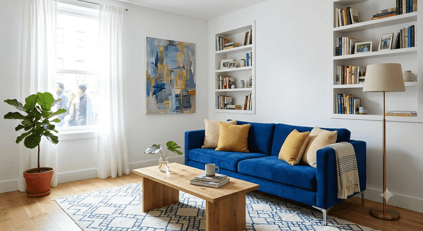
18. Cobalt Blue Sofa as Statement Piece
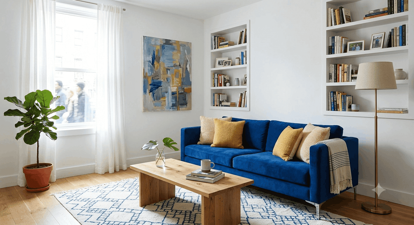
A cobalt blue sofa is a show-stopping centerpiece that instantly elevates a living room from ordinary to extraordinary. This electric, saturated blue demands attention and sets the tone for the entire space, making it perfect for anyone who wants their living room to feel bold and confident. Pair it with crisp white walls for maximum contrast, or go moody with charcoal or navy walls for a more dramatic, cocooning effect. The beauty of a blue sofa is its versatility. it works with warm and cool tones alike, making it easy to accessorize.
When styling a cobalt sofa, think about contrast and complement. Mustard yellow, coral, and emerald green all create beautiful color pairings that feel intentional rather than random. Metallic accents in brass, gold, or chrome will catch the light and add glamour, while natural wood tones keep things feeling grounded. White or cream pillows and throws will prevent the blue from feeling overwhelming, and a patterned rug that incorporates the blue will tie the whole look together. This is a commitment piece, but it’s the kind of commitment that makes a room unforgettable.
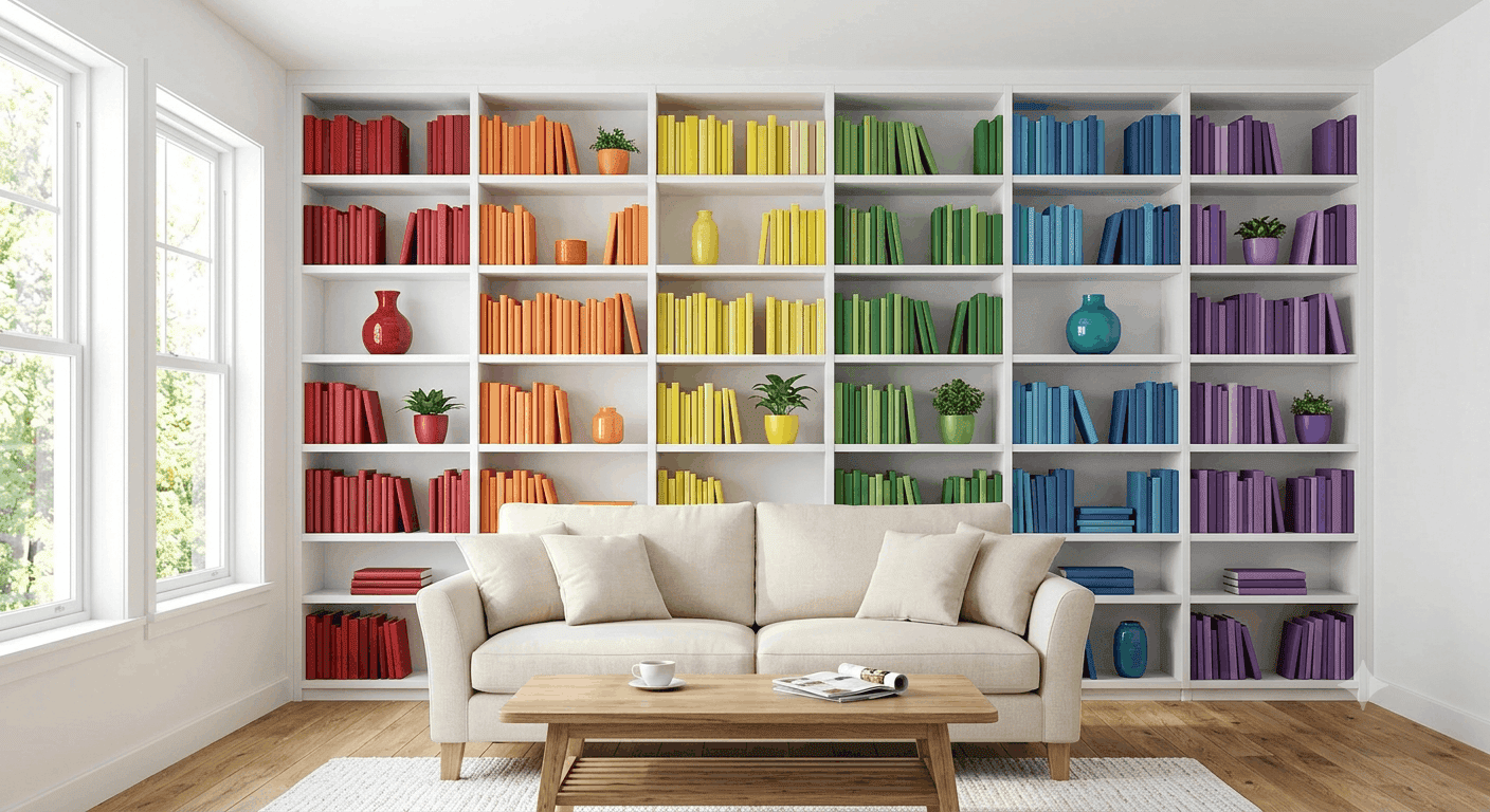
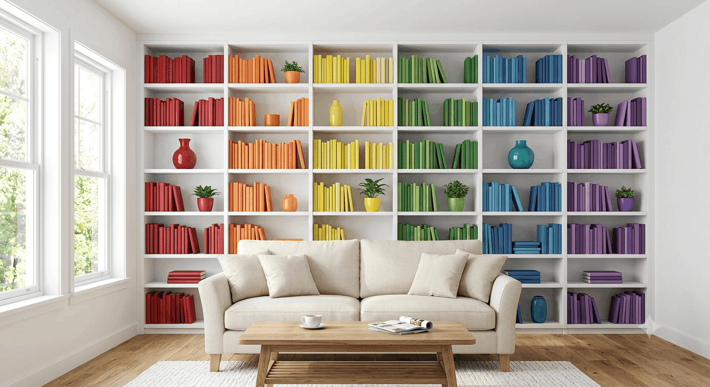
19. Rainbow Bookshelf Styling
If you have built-in shelves or a large bookcase, styling your books and decor in a rainbow gradient creates an instant color statement that’s both playful and organized. Arrange your books by color rather than author or genre, creating a satisfying spectrum from red through violet. Intersperse decorative objects, vases, sculptures, plants in coordinating colors to break up the books and add visual interest. This approach works especially well in eclectic or maximalist spaces, but it can also add a pop of personality to more traditional rooms.
The key to making rainbow bookshelves work is maintaining some consistency in your book spines, hardcovers tend to look more uniform than paperbacks, and removing dust jackets can create a cleaner look. Don’t stress about perfection; the goal is a general color flow rather than a Pantone-perfect gradient. Mix in some neutral elements like white or cream vases, natural wood objects, or black-and-white photography to give the eye places to rest. This look is particularly effective in home offices, living rooms, or any space where you want to showcase your personality through your collection.
20. Burnt Orange and Teal Retro Revival
Burnt orange and teal create a retro-inspired color pairing that channels 1960s and 70s design while feeling surprisingly fresh in 2026. These complementary colors one warm and earthy, the other cool and vibrant, create a dynamic tension that feels both nostalgic and modern. Use burnt orange as your dominant color through a sofa, accent wall, or large rug, then layer in teal through chairs, pillows, or artwork. This palette works beautifully in mid-century modern spaces but can also add unexpected character to contemporary or even traditional rooms.
The secret to making this retro combo feel current rather than dated is in the execution choose modern furniture silhouettes and avoid going too literal with the 70s aesthetic. Think clean lines, quality materials, and a restrained approach to pattern. Burnt orange velvet or bouclé fabrics feel particularly on-trend right now, as does matte teal paint in an eggshell or satin finish. Add brass or gold accents to enhance the retro vibe, and keep walls relatively neutral to let the furniture colors shine. This is a bold choice that pays off for anyone who wants their space to feel distinctive and personality-driven.
21. Lavender Walls with Gray and Gold Accents
Lavender walls might sound risky, but when done right, this soft purple hue creates a dreamy, sophisticated atmosphere that feels both calming and luxurious. The key is choosing a lavender with enough gray in it to feel grown-up think Benjamin Moore’s Lavender Mist or Farrow & Ball’s Setting Plaster rather than a bright Easter egg purple. Pair it with gray furniture, white trim, and gold or brass accents for a look that feels elegant and serene. This palette works particularly well in formal living rooms, bedrooms, or any space where you want to create a sense of tranquility.
Lavender is surprisingly versatile, pairing beautifully with both warm and cool tones depending on the specific shade you choose. Cooler lavenders work well with grays, blues, and silvers, while warmer lavenders with pink undertones pair beautifully with creams, golds, and soft browns. Layer in plenty of texture through velvet, silk, and wool to keep the space feeling rich and inviting. Add fresh flowers in white or soft pink to enhance the romantic, ethereal vibe. This is a color choice that feels both timeless and unexpected, perfect for anyone who wants their space to feel distinctive without being aggressive.
22. Multi-Colored Patterned Rug as Foundation
A bold, multi-colored patterned rug can serve as the color foundation for an entire living room, allowing you to keep walls and furniture relatively neutral while still creating a vibrant space. Look for rugs that incorporate several colors you love perhaps blues, oranges, and creams in a geometric pattern, or a traditional Persian with rich reds, blues, and golds. Pull accent colors from the rug for your pillows, throws, and artwork, creating a cohesive color story that feels intentional. This approach is perfect for renters or anyone who wants flexibility to change their look over time.
The beauty of using a rug as your color anchor is that it grounds the space while allowing for easy updates. If you ever tire of your current accent colors, simply swap out pillows and artwork rather than replacing major furniture or repainting walls. When selecting a patterned rug, consider scale a large room can handle a bold, large-scale pattern, while smaller spaces might benefit from a more delicate design. Make sure the rug is large enough to anchor your seating area, with at least the front legs of your sofa and chairs resting on it. This creates a cohesive, pulled-together look that feels designed rather than accidental.
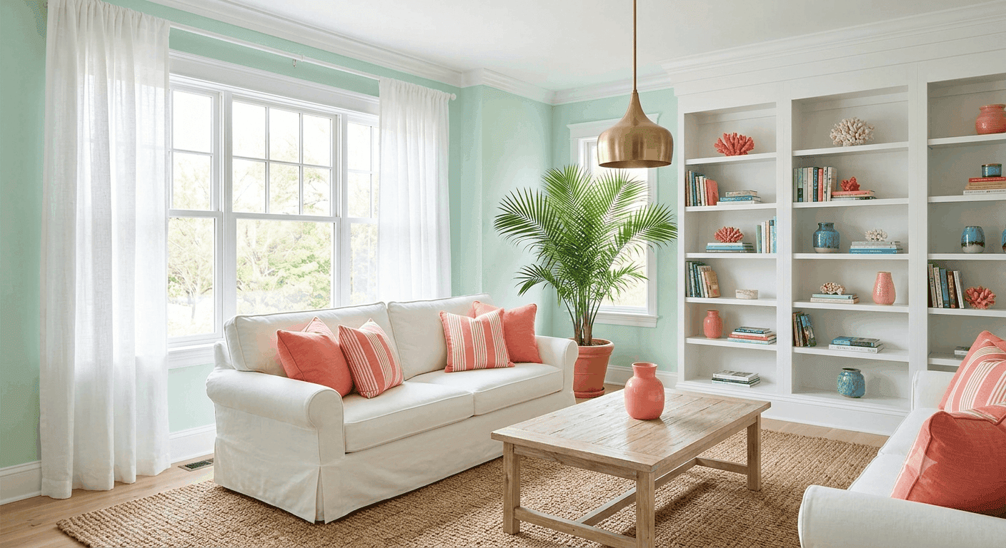
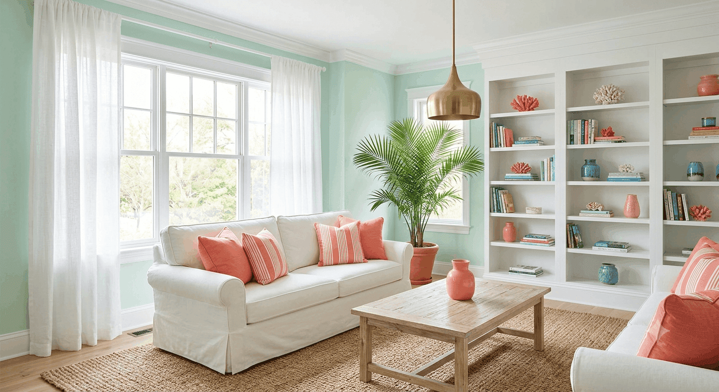
23. Mint Green and Coral Coastal Vibes
Mint green and coral create a fresh, coastal-inspired palette that brings beachy relaxation into any living space, regardless of proximity to actual water. The soft, cool mint provides a calming backdrop while the warm coral adds energy and warmth, creating a balanced, inviting atmosphere. This combination works beautifully in casual, relaxed spaces think slipcovered sofas, natural wood, jute rugs, and plenty of natural light. It’s particularly effective in sunrooms, enclosed porches, or any space where you want to create a vacation-like feeling year-round.
To keep this look feeling sophisticated rather than beach-cottage kitschy, choose muted, sophisticated versions of both colors. Think Benjamin Moore’s Sea Mist for the mint and a dusty coral rather than bright neon versions. Layer in plenty of white to keep things feeling fresh and airy, and add natural textures like rattan, linen, and weathered wood to enhance the coastal vibe. Brass or gold accents will add a touch of glamour, while blue accents can deepen the oceanic feel. This palette also works wonderfully in bedrooms or bathrooms if you want to carry the coastal theme throughout your home.
24. Deep Plum Velvet Furniture
Deep plum velvet furniture brings instant luxury and drama to a living room, creating a rich, jewel-toned focal point that feels both regal and inviting. This saturated purple-red hue works beautifully in formal spaces or anywhere you want to create a sense of intimacy and sophistication. Pair it with cream or light gray walls to let the plum shine, or go moody with charcoal or navy walls for maximum drama.The velvet upholstery catches light beautifully, creating subtle shifts in color throughout the day that keep the piece feeling dynamic rather than static.
The key to making plum furniture work without feeling overwhelming is balancing it with lighter, airier elements. Cream or white walls, light wood floors, and plenty of natural light will prevent the space from feeling like a vampire’s lair. Metallic accents in brass, gold, or chrome will enhance the glamour factor, while natural materials like wood and stone keep things feeling grounded. Add touches of complementary colors like emerald green or mustard yellow in pillows and artwork to create a rich, layered color story. This is a bold choice that pays off for anyone who wants their living room to feel like a luxurious retreat.
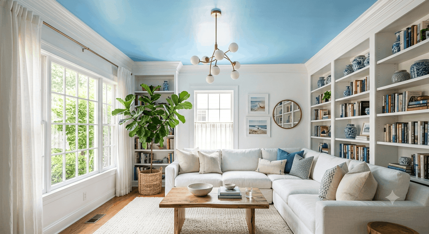
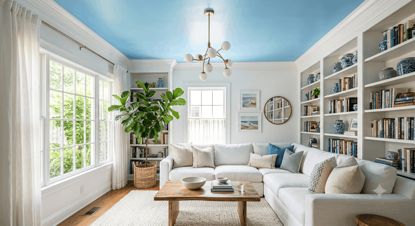
25. Sky Blue Ceiling with White Walls
Painting your ceiling sky blue while keeping walls white creates an unexpected pop of color that feels both playful and sophisticated, like bringing a piece of the outdoors inside. This technique, sometimes called a “fifth wall” treatment, adds visual interest without overwhelming the space, making it perfect for anyone who wants color but isn’t ready to commit to painted walls. The blue ceiling draws the eye upward, making rooms feel taller and more expansive, while the white walls keep everything feeling fresh and airy.
This look works particularly well in rooms with architectural details like crown molding, beams, or coffered ceilings, where the blue paint will highlight those features beautifully. Choose a soft, airy blue like Benjamin Moore’s Sky Blue or Farrow & Ball’s Blue Ground for the most elegant effect avoid anything too bright or primary, which can feel juvenile. Pair with white or light gray furniture, natural wood accents, and plenty of plants to enhance the outdoor-inspired vibe. This is a surprisingly versatile technique that works in traditional, transitional, and even modern spaces.
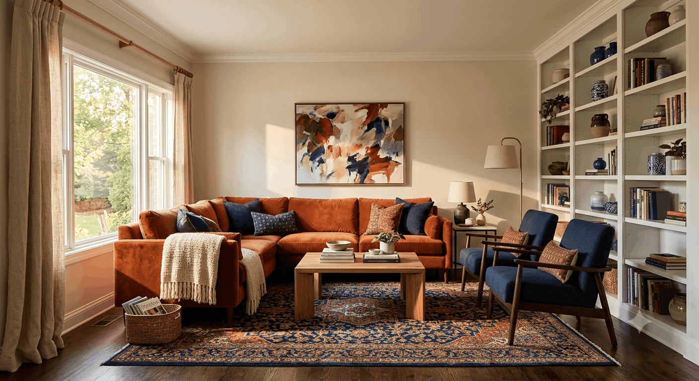
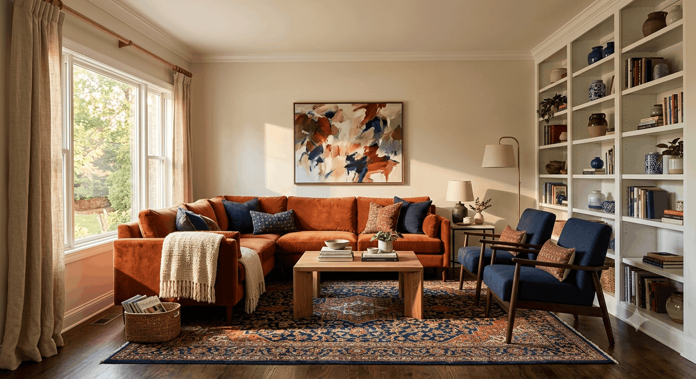
26. Rust and Navy Classic Combination
Rust and navy create a timeless, sophisticated color pairing that feels both warm and cool, earthy and refined. The burnt orange-red of rust brings warmth and energy, while the deep blue of navy provides grounding and depth. This combination works beautifully in traditional or transitional spaces, but it can also add unexpected character to modern rooms. Use rust as your dominant color through a sofa or accent wall, then layer in navy through chairs, pillows, or artwork for a balanced, intentional look.
The beauty of this pairing is its versatility as both colors work well with a wide range of other hues, making it easy to accessorize and update over time. Cream, white, and natural wood tones keep things feeling fresh and airy, while gold or brass accents add glamour. Emerald green, mustard yellow, or even blush pink can all work as tertiary accent colors if you want to add more complexity. This palette also works wonderfully in bedrooms, dining rooms, or home offices if you want to create a cohesive color story throughout your home.
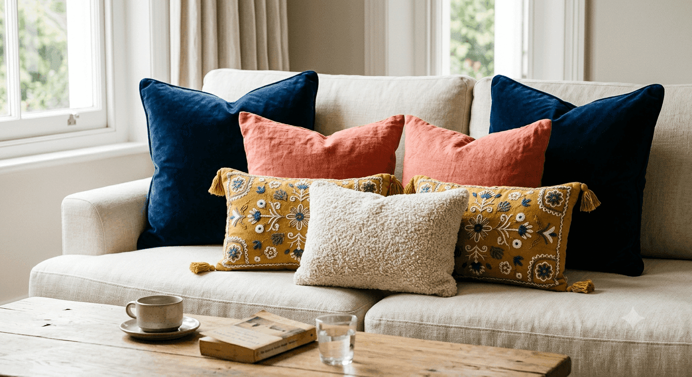
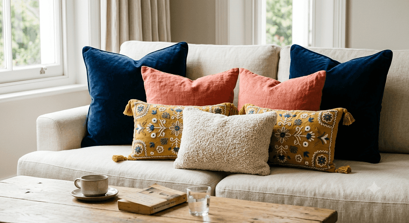
27. Colorful Throw Pillows on Neutral Sofa
The easiest, most budget-friendly way to inject color into your living room is through a curated collection of throw pillows on a neutral sofa. Mix and match colors, patterns, and textures think velvet, linen, bouclé, and embroidered fabrics in a range of hues that make you happy. This approach is perfect for renters, commitment-phobes, or anyone who likes to refresh their space seasonally. You can completely change the vibe of your room with a $200 investment in new pillows rather than thousands on furniture or paint.
The key to making colorful pillows look intentional rather than random is choosing a cohesive color palette and repeating colors throughout the arrangement. For example, if you have blue, coral, and mustard pillows, make sure each color appears at least twice. Mix large solid-color pillows with smaller patterned ones, and don’t forget texture a chunky knit or embroidered pillow adds visual interest even in a neutral tone. Layer pillows in odd numbers (three or five rather than two or four) for a more relaxed, styled look. This is the simplest way to test your comfort level with color before making bigger commitments.
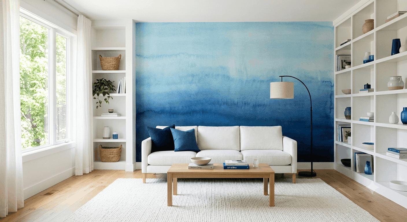
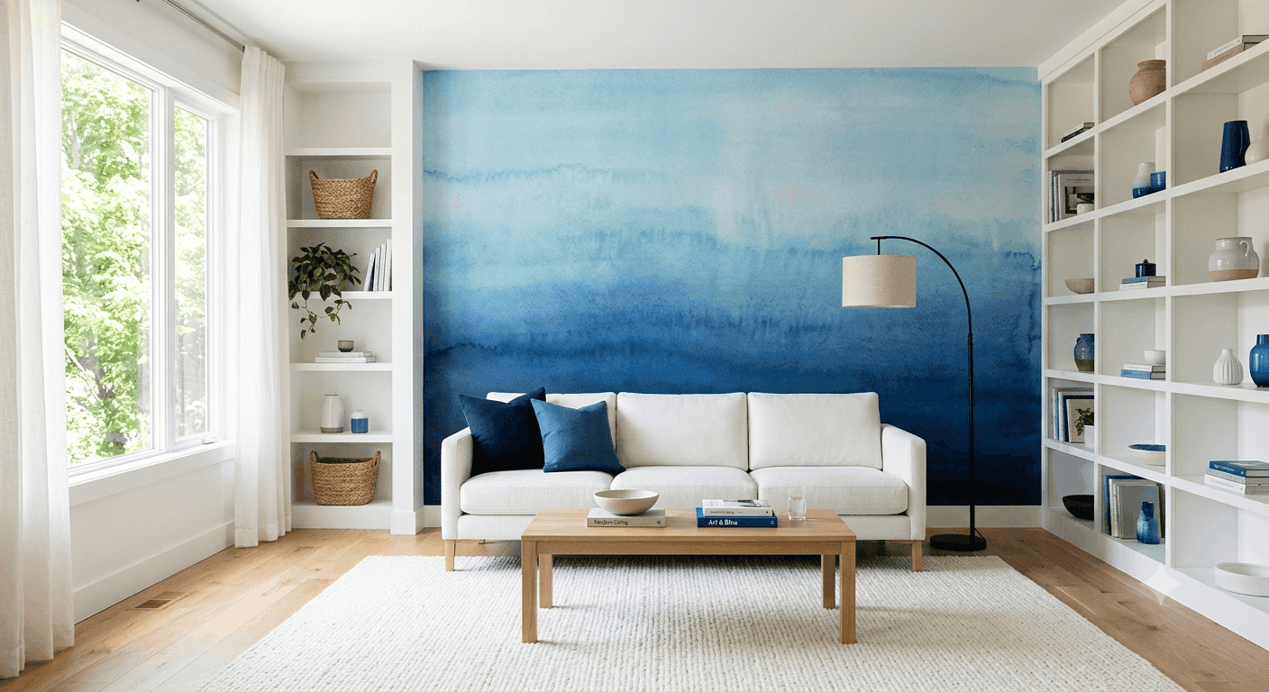
28. Ombre Wall Gradient Effect
An ombre wall that gradients from one color to another creates a stunning, artistic focal point that feels like living inside a watercolor painting. This technique works beautifully as an accent wall behind a sofa or fireplace, where it can serve as the room’s primary visual interest. Choose two complementary or analogous colors perhaps navy fading to sky blue, or blush pink gradients to deep rose and have a professional painter create a smooth transition. This is a bold choice that pays off in spades for anyone who wants their space to feel truly unique and custom.
The key to making ombre work is scale and placement this technique is best suited for a single accent wall rather than all four walls, which could feel overwhelming. Keep the rest of the room relatively neutral to let the wall shine, with white or light gray walls, simple furniture, and minimal competing patterns. This look works particularly well in modern or contemporary spaces, but it can also add unexpected artistry to traditional rooms. Be aware that this is a more expensive paint technique than standard walls, so it’s an investment but one that creates a truly custom, gallery-like effect.
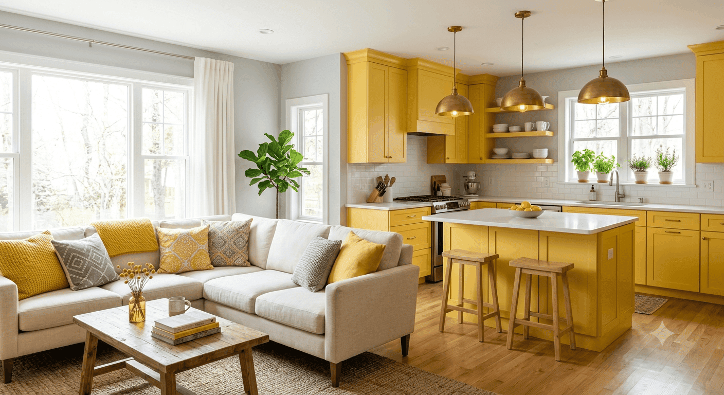
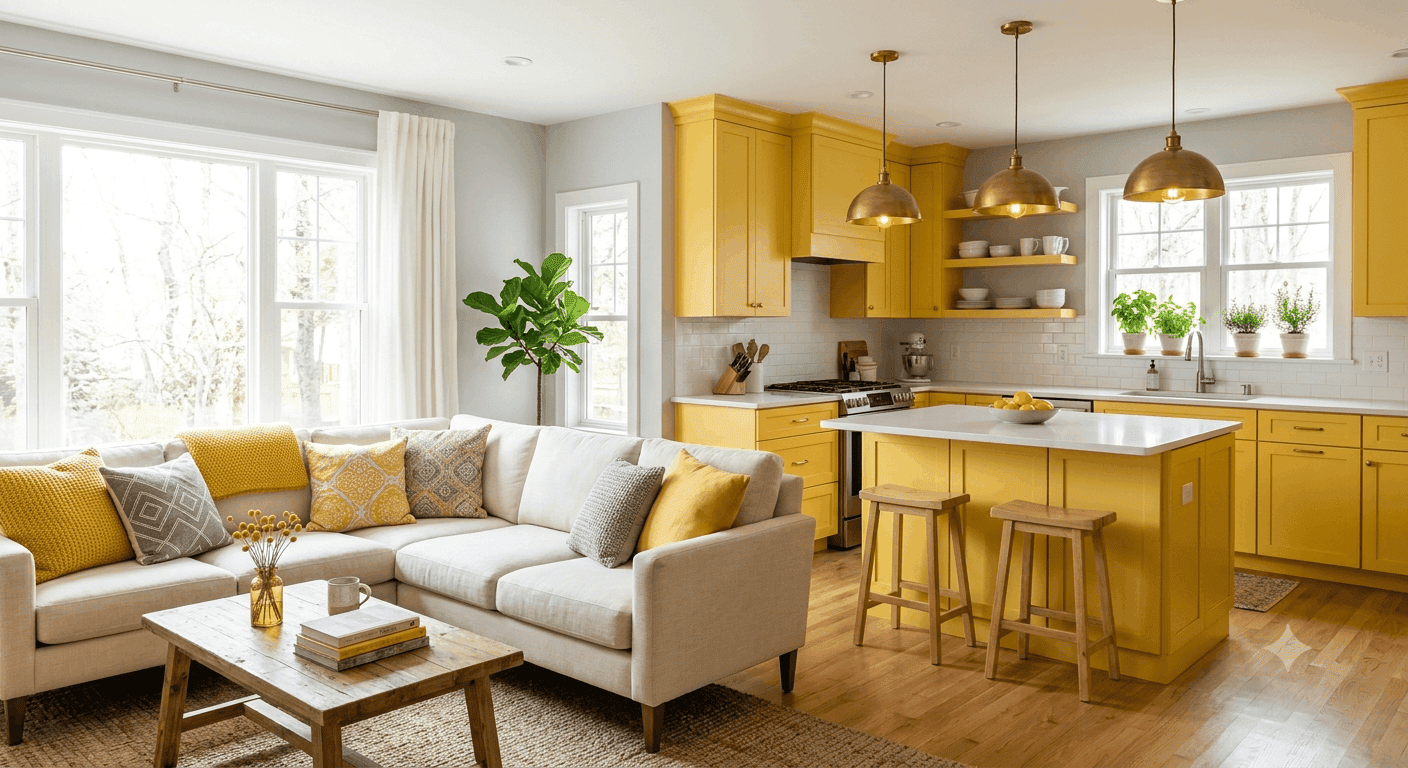
29. Sunshine Yellow Kitchen-to-Living Flow
If your living room opens into a kitchen, painting the kitchen cabinets or walls in sunshine yellow creates a cheerful, energetic flow between the two spaces. This bright, happy yellow brings warmth and optimism to what’s often the most-used part of the home, and it naturally extends into the living area, creating a cohesive, inviting atmosphere. Pair yellow kitchens with neutral living room walls in white, gray, or soft beige, then echo the yellow in living room accents like pillows, throws, or artwork to tie the spaces together.
Sunshine yellow works particularly well in homes with limited natural light, where it can create the illusion of brightness and warmth even on cloudy days. Choose a yellow with enough depth to feel sophisticated think Benjamin Moore’s Hawthorne Yellow or Farrow & Ball’s India Yellow rather than a bright lemon or neon yellow. This color pairs beautifully with natural wood, brass or gold accents, and plenty of greenery, creating a fresh, organic feel. It’s also surprisingly versatile, working in farmhouse, modern, traditional, and eclectic spaces alike.
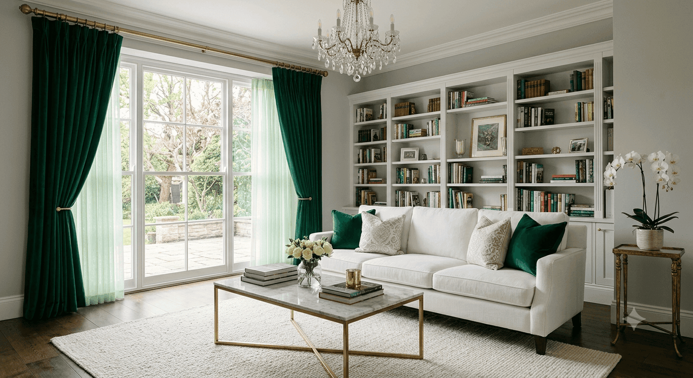
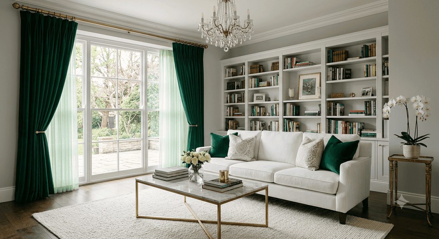
30. Jewel-Toned Curtains as Statement
Floor-to-ceiling curtains in a rich jewel tone emerald, sapphire, amethyst, or ruby, create instant drama and sophistication, framing your windows like precious gems. This approach works beautifully in rooms with high ceilings or large windows, where the curtains can make a real impact. Pair jewel-toned drapes with neutral walls and furniture to let them shine, or go maximalist by echoing the curtain color in pillows, rugs, or artwork. Heavy velvet or linen curtains in saturated colors feel particularly luxurious and on-trend for 2026.
The key to making jewel-toned curtains work is ensuring they’re properly sized and hung, install the rod as close to the ceiling as possible and let the curtains puddle slightly on the floor for a custom, high-end look. This creates the illusion of taller ceilings and more grandeur. Choose a color that complements your existing furniture and decor rather than competing with it. If you have a neutral sofa, emerald or navy curtains create stunning contrast. If your sofa is already colorful, consider a complementary jewel tone or stick with a rich neutral like charcoal. This is a relatively low-commitment way to add major color impact.
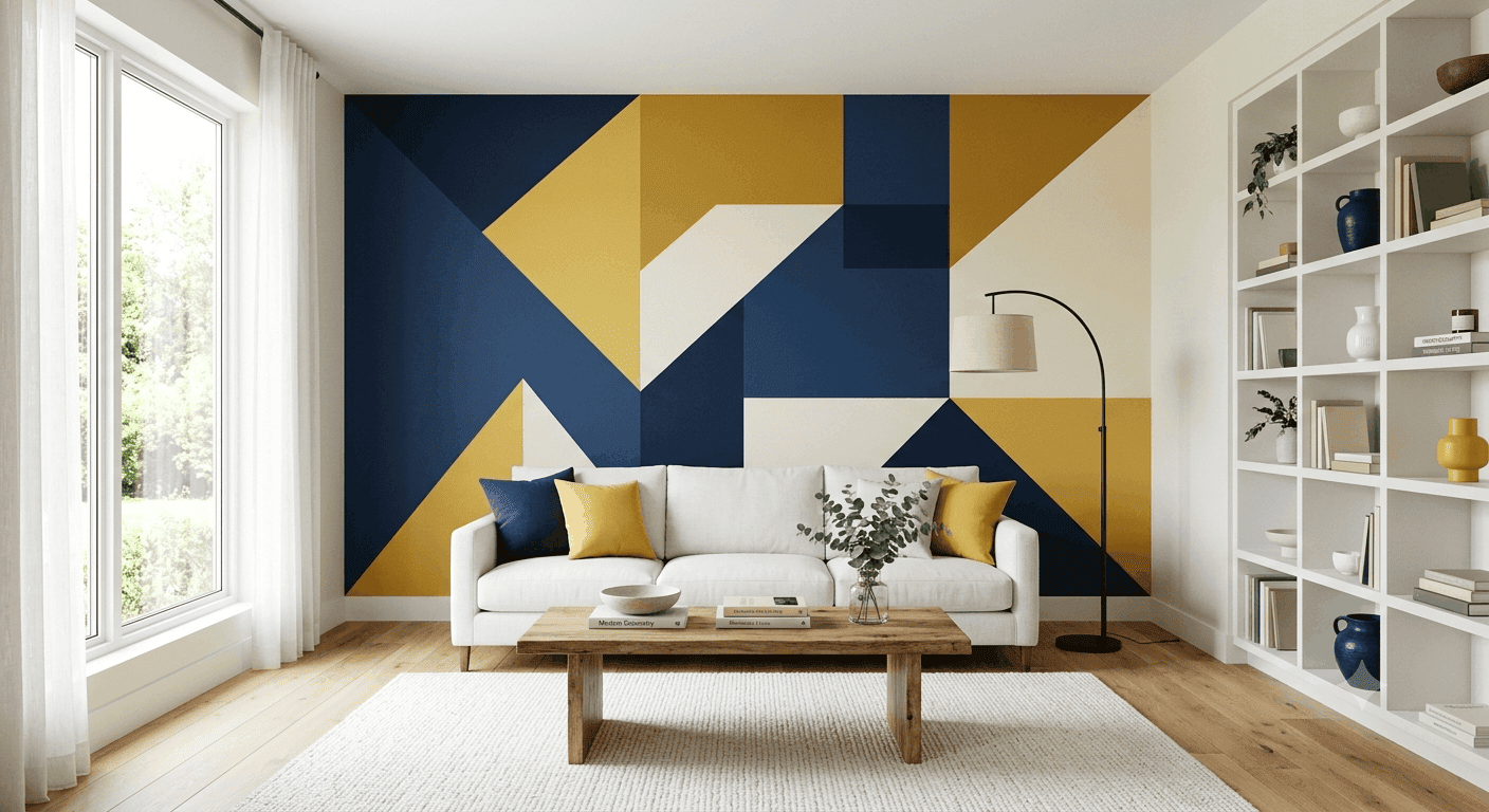
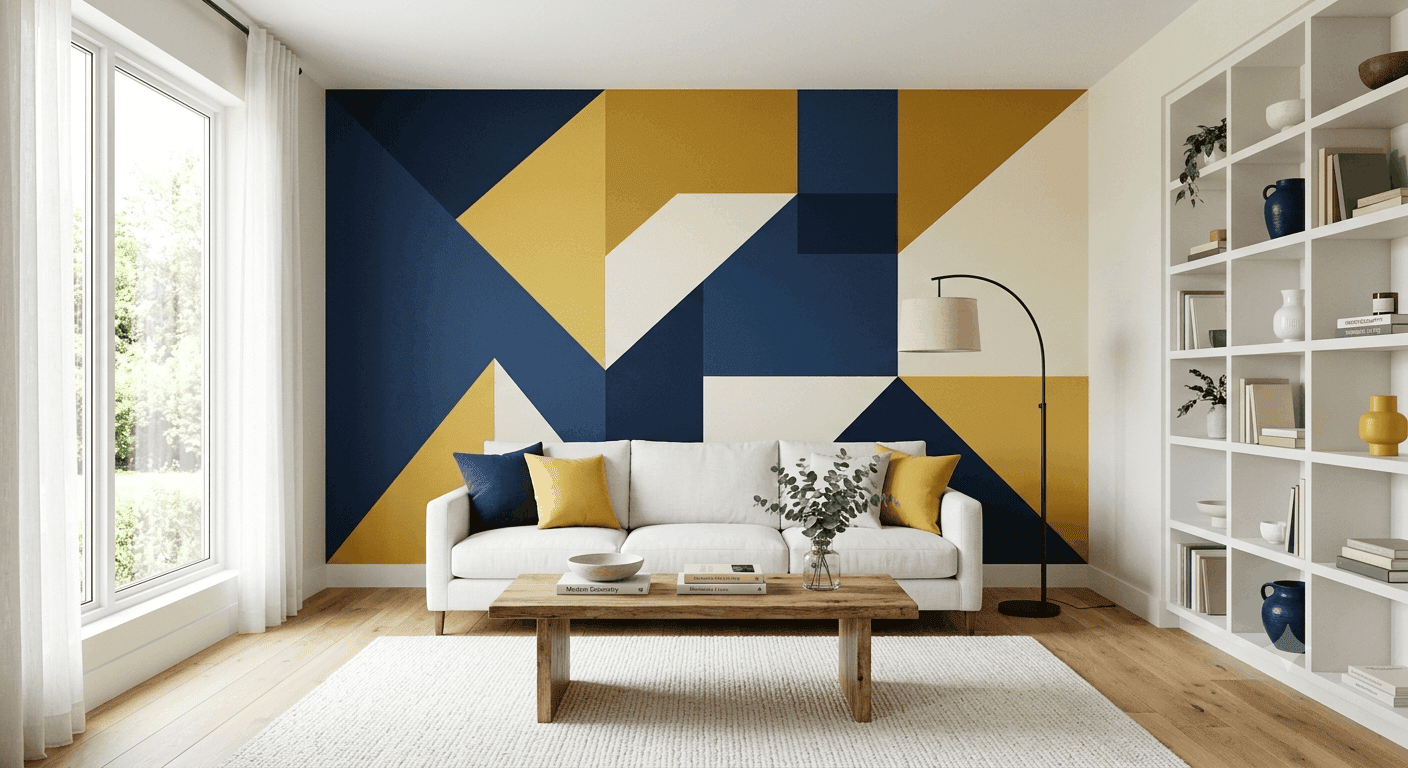
31. Color-Blocked Accent Wall
A color-blocked accent wall featuring two or three bold geometric shapes creates a modern, artistic statement that feels like living inside a Mondrian painting. This technique works beautifully in contemporary or mid-century modern spaces, where clean lines and bold colors are already part of the design language. Choose two or three complementary colors perhaps navy, mustard, and cream, or blush, forest green, and white and work with a painter to create crisp, clean lines between the blocks. This is a bold choice that creates instant visual interest and personality.
The key to making color-blocking work is planning and precision, sketch out your design on paper first, measure carefully, and use high-quality painter’s tape to ensure clean lines. Keep the rest of the room relatively simple to let the wall shine, with neutral furniture and minimal competing patterns. This look works particularly well behind a sofa, bed, or console table, where it can serve as the room’s primary focal point. Be aware that this is a more complex paint job than standard walls, so consider hiring a professional if you’re not confident in your DIY skills.
32. Multicolor Mosaic Tile Accent
A multicolor mosaic tile accent wall or fireplace surround creates a stunning, textural focal point that feels both artistic and architectural. This technique works beautifully in Mediterranean, Spanish, or eclectic spaces, where colorful tile is already part of the design language. Choose tiles in a range of complementary colors perhaps blues, greens, and creams in a Moroccan pattern, or a rainbow of small glass tiles in a modern geometric design. This is a more permanent, investment-heavy choice, but it creates a truly custom, one-of-a-kind feature that will be a conversation starter for years.
The key to making mosaic tile work is scale and placement, this technique is best suited for a single accent wall, fireplace surround, or backsplash rather than covering an entire room. Keep the rest of the space relatively neutral to let the tile shine, with simple furniture and minimal competing patterns. This look works particularly well in rooms with high ceilings or architectural details that can handle the drama. Be aware that tile installation is a significant investment, so consider working with a professional designer or installer to ensure the best results.
Your Colorful Living Room Awaits
There you have it 32 distinct, actionable ways to bring color into your living room, from subtle pillow swaps to full-on rainbow ceiling statements. The beauty of color is that there’s no single “right” way to do it; the best approach is the one that makes you feel happy, energized, and at home in your space. Whether you’re drawn to moody jewel tones, sunny yellows, or playful rainbows, the key is to start where you’re comfortable and build from there.


.png)


.png)


.png)


.png)

.png)


.png)





.png)
.png)